Center for Earth Observing and Spatial Research


El Niño Update for September 2026

El Niño events occur every two to seven years, and they are driven by feedback between ocean currents and the circulation of the atmosphere over the tropical Pacific Ocean. Variation in ocean temperature and wind patterns drives variation in the rain and snow that falls over the tropical Pacific and elsewhere in the world. Many forecasts have been issued for the El Niño that started in the summer of 2026, and past El Niños have been extensively discussed during the months leading up to this one. One way that NASA contributes to the conversation is to provide, in near real time, estimates of how much precipitation falls over oceans and continents. GMU’s CEOSR team assists NASA with evaluating these precipitation estimates and with evaluating new versions of the precipitation-estimating algorithm before they becomes operational.

A few hours after September ended, NASA provided initial, near real-time estimates of July–September precipitation totals around the world. These three-month totals deviated significantly from seasonal averages in many places. For example, part of India this summer experienced its worst drought since 2015, another year when a strong El Niño was ramping up. Most strong El Niños start in spring or summer and last until the following spring, and so they are named after these two years, such as 2026–27.

Not every precipitation anomaly that occurs during an El Niño is caused by the El Niño, and it will take years of study for scientists to fully understand the story of the 2026–27 El Niño. Nonetheless, it is an important first step to measure precipitation globally and to identify the ways that, during the 2026–27 El Niño, precipitation differs from the long-term average. Such research can contribute to mitigating the societal harm that the current or a future El Niño could cause.

Three-Month Precipitation Totals from NASA’s IMERG

The simplest way to evaluate the precipitation that fell this July through September is to compare it to the long-term average for this time of year. NASA monitors rainfall and snowfall in near real time using IMERG, the agency’s data-processing algorithm that combines observations from all available satellites that observe the Earth at microwave or infrared frequencies. IMERG stands for Integrated Multi-satellitE Retrievals for the Global Precipitation Measurement (GPM) Mission. IMERG estimates global precipitation every 30 minutes at approximately 11-kilometer resolution (0.1°⨯0.1° in latitude and longitude). IMERG estimates are available from January 1998 onward.

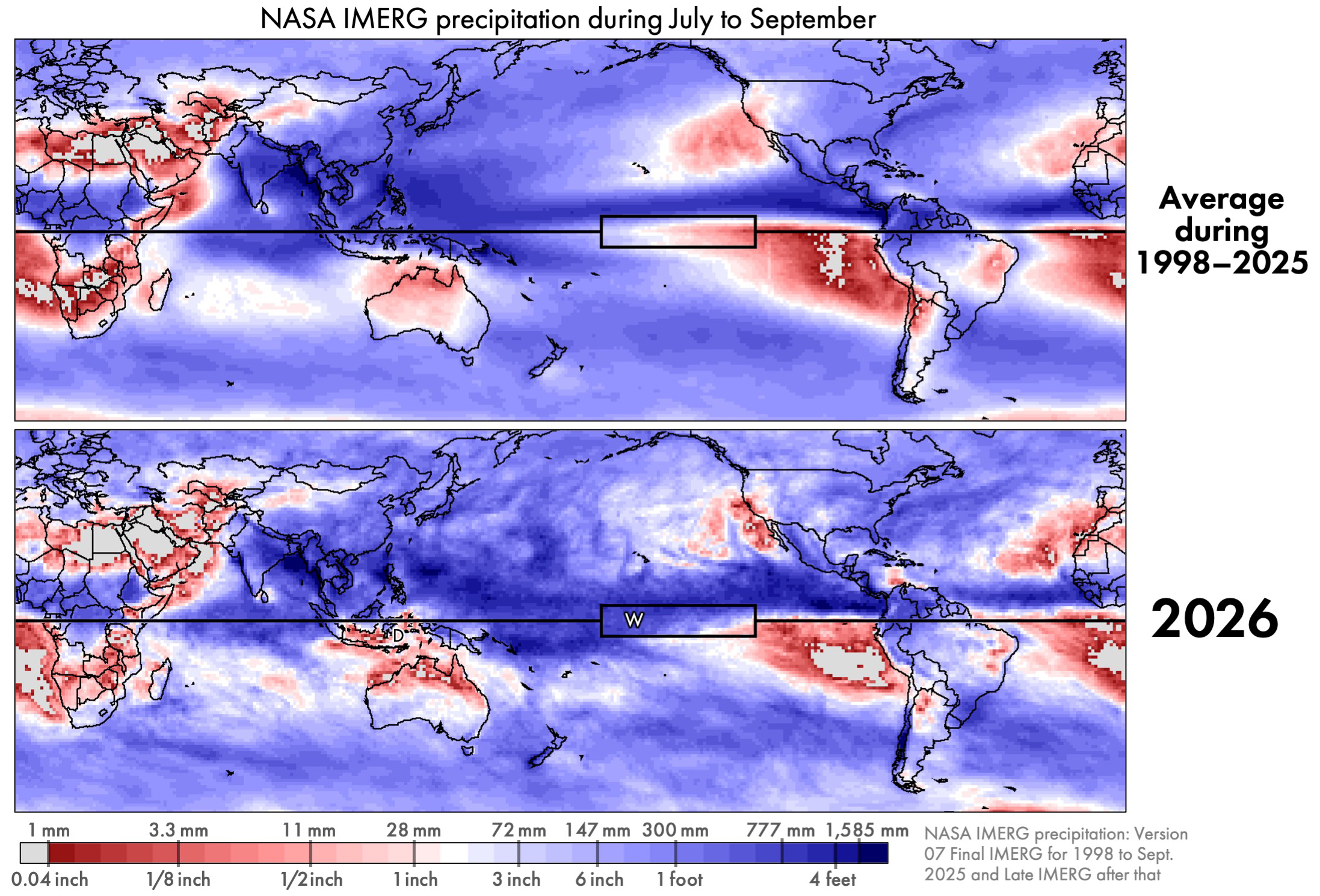
Figure 1. IMERG precipitation accumulation for July through September either averaging over 1998–2025 (top) or just during 2026 (bottom) [High-res image]

El Niño changes some aspects of global precipitation but is powerless to change other aspects of it. Regardless of the state of El Niño or other atmospheric oscillations, the approximate location of Earth’s wettest and driest places remains about the same. And the range of annual accumulation is huge: about a factor of 100. The annual accumulation of rain and snow is under 1 inch in some places and over a 100 inches elsewhere (<25.4 mm vs. >2,540 mm). For July through September, Figure 1 shows deserts in light gray and the places with the most precipitation in dark blue. In these totals, any snowfall is represented by the depth it would have if it were melted.

Throughout the year, frequent storms near the Equator cause this region’s rainfall accumulation to be among the largest on Earth. In the subtropics, there are several permanent patches of extreme desert over land or ocean. Despite the persistence of these large-scale precipitation zones, their boundaries do shift a bit throughout the year and from year to year. In Figure 1, the Equator is depicted by the black horizontal line. The box along the Equator is the Niño 3.4 region where sea surface temperature is monitored to determine when an El Niño event is occurring.

Unusual aspects of precipitation during 2026 can be seen in Figure 1, but not very clearly. Near the Equator, the three-month period of July–September 2026 saw more precipitation than average in the Central Pacific and less precipitation than average in the East Pacific. It is easier to see such differences if they are explicitly plotted.

Percent Difference and Absolute Difference

Examining two kinds of differences can help interpret the rainfall data: absolute difference and percent difference. An absolute difference is calculated by subtracting a reference values from current conditions, and it has units of millimeters of precipitation accumulation. Alternatively, one can display the percent difference between current and reference values. For the data examined here, the current conditions are the three-month accumulation from IMERG during July–September 2026 and the reference value is the average July–September accumulation from IMERG during 1998–2025. The difference between current conditions and the long-term average is often called an anomaly by atmospheric scientists. The use of the term anomaly does not mean that the observed difference is necessarily surprising or dangerous.

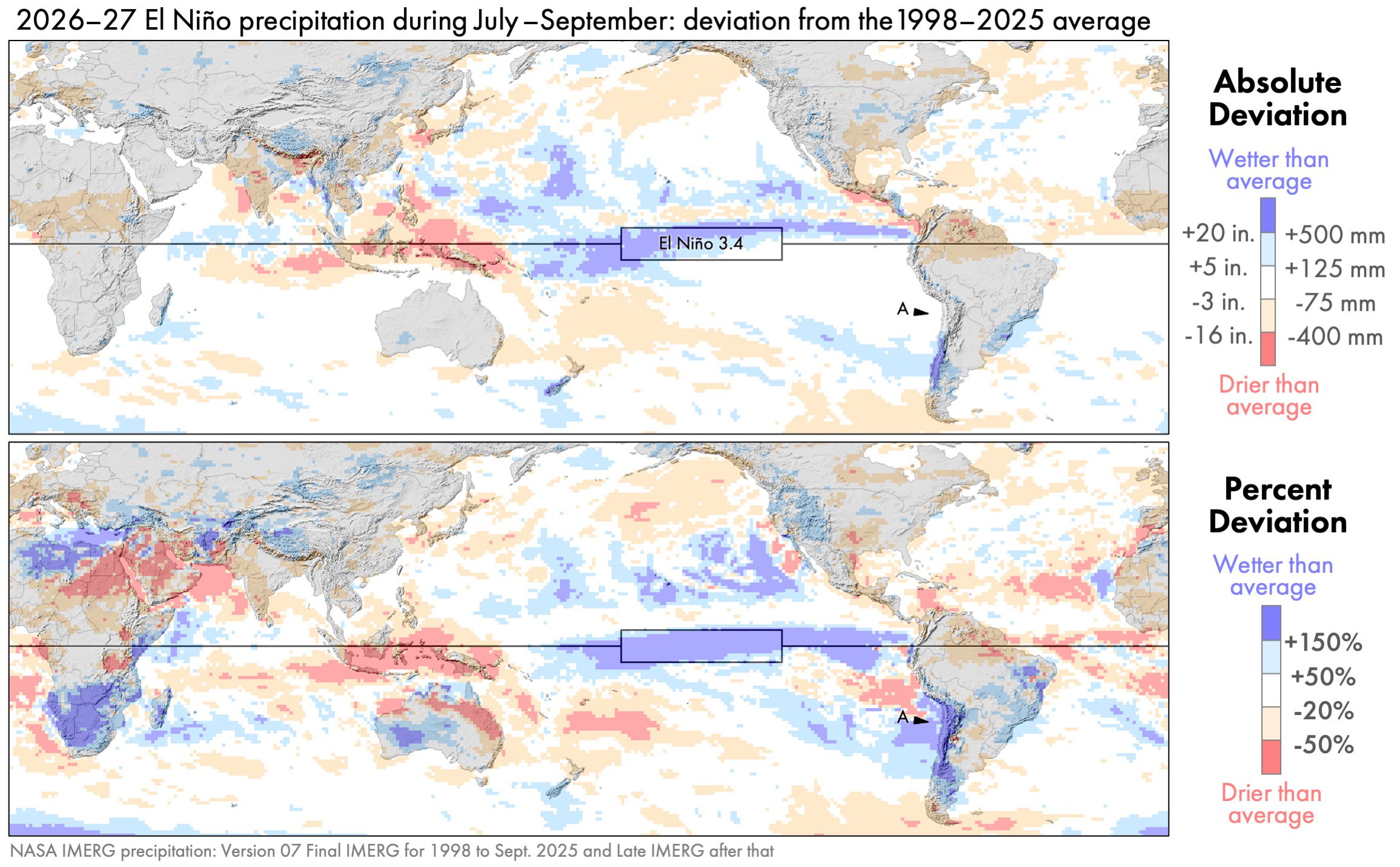
Figure 2. IMERG precipitation anomalies for July–September 2026: absolute difference (top) and percent difference (bottom) [High-res image]

In absolute terms, the two largest anomalies during July–September 2026 occurred near the Equator over the Pacific Ocean. Precipitation was 500 millimeter (20 inches) greater than average in part of the Central Pacific and 400 millimeters (16 inches) less than average in part of the Western Pacific. These features are dark blue and dark red, respectively, in the top panel of Figure 2.

If one looks only at absolute difference, then one will miss most of the precipitation anomalies that occur in arid regions. For example, consider the west coast of South America, and specifically Chile’s Atacama Desert. This desert is identified by point A in the bottom panel of Figure 2. The absolute anomaly here is near zero (white in the top panel). Yet, a large relative increase in precipitation is seen in the percent-difference map (dark blue in the bottom panel).

Illustrating this point, the Chile meteorological agency reported that a particular rain gauge in the Atacama Desert receives an average of 4 mm (0.16 inches) per year of precipitation, but it received much more, 14.8 mm (0.58 inches), in August 2026. This gauge (#230001) is located along the west coast of South America. Consistent with this rain-gauge data, the satellite-based IMERG estimate was that the July–September 2026 rainfall total at this location was more than 150% above the long-term average.

It can be difficult for a satellite-based dataset to provide accurate estimates of precipitation in an arid location because there is so little precipitation to see there. One way to increase confidence in near real-time IMERG estimates is to compare them to an independent dataset that is also available in near real time. Within a few days of a month ending, the German meteorological service creates the GPCC First Guess dataset for that month, based on the limited number of rain gauges around the world whose observations are published in time to be included.

Figure 3. Precipitation anomalies for the same period as Figure 2 except using GPCC rain-gauge estimates rather than IMERG satellite estimates [High-res image]

One would expect global precipitation patterns to differ somewhat depending on whether they are based on observations from rain gauges or polar-orbiting satellites. Rain gauges continuously collect information throughout the day, but are separated by large distances. Polar-orbiting satellites fly over a location for just one instant, but they cover a region with a dense set of observations when an overflight does occur. Despite the different strengths and weaknesses of these instruments, gauge and satellite datasets show remarkably similar large-scale features in this case. During July–September 2026, both datasets show similar precipitation anomalies, comparing Figures 2 and 3. The two datasets generally agree on the sign of the large-scale precipitation anomalies on each continent and their approximately location.

Rain Over the Atacama Desert

According to IMERG, the Atacama Desert in northern Chile received precipitation during July–September 2026 that was 150% above the average amount for this time of year. In other words, 2.5 times normal precipitation fell: 100% of the normal amount plus an extra amount equal to 150% of the normal amount.

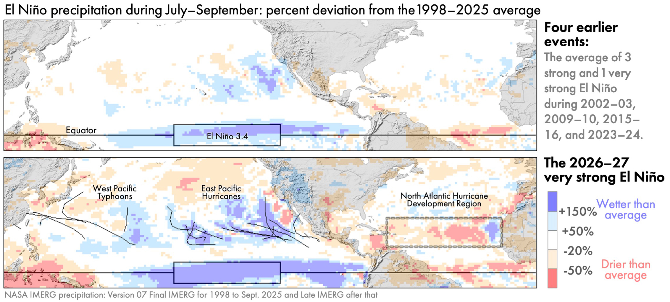
While the 2026–27 El Niño brought heavy rain to the Atacama Desert, this pattern was not following during the four strongest El Niños during 1998–2025. These four El Niños occurred in 2002–03, 2009–10, 2015–16, and 2023–24. Whether an El Niño is categorized as strong or not can depend on whether one is looking at the ONI or RONI index to measure it.

Figure 4. July–September precipitation anomaly during typical El Niño years (top) or during the El Niño that started in the summer of 2026 (bottom) [High-res image]

The bottom panel of Figure 4 shows that the early months of the 2026–27 El Niño had far more precipitation over the Atacama Desert that was typical during prior El Niños (top panel of Figure 4). Much of this rain fell on a single day, namely August 18, 2026. The figure below shows a satellite overflight of the storm that brought this rain. The data was collected by the passive-microwave instrument on the Core Observatory satellite of NASA’s Global Precipitation Measurement (GPM) Mission. The instrument is called the GPM Microwave Imager, or GMI for short. Microwave radiometers like GMI have the advantage of seeing into clouds to provide X-ray-like 2D images. In contrast, satellite instruments observing infrared radiation can only gather information about the height of cloud tops, which is a measurement that is only loosely tied to a storm’s ability to produce heavy rain at the Earth’s surface.

Figure 5 (below) is a false-color image generated using three frequencies of radiation measured by GMI, each one controlling the amount of red, green, or blue in the image. This visualization technique was first proposed by Negri et al. (1987). In the false-color image, GMI data over ocean is green-blue where the air column is dry and dark blue where the air column holds more water vapor. Over ocean, low clouds are black and high clouds are light gray. Cloud-free land is dark green-brown. The figure shows six GMI overflights, with the gaps between them filled with infrared satellite observations of cloud-top height.

Figure 5. GMI observations of storms bringing rain to Chile on August 18, 2026 [High-res image]

Labeled L in the figure, a cutoff low on August 18, 2026, was pulling humid tropical air south to fuel the precipitation over the Atacama Desert in northern Chile. Cutoff lows are fairly common off the west coast of South America, but this one formed a bit further north than usual (Fuenzalida et al. 2005). Cutoff lows contribute to the formation of a significant number of the rare, heavy precipitation events in several arid regions around the world (de Vries et al. 2024). Cutoff lows can be identified using the archive of upper-air charts at the University of Wyoming.

Also on August 18, an atmospheric river was bringing humid tropical air south to the forests of central Chile. An atmospheric river is a channel of fast-moving low-altitude air (a low-level jet) carrying water vapor to mid-latitudes. Most atmospheric rivers flow across the front edge of an advancing cold front (Dacre and Clark 2025, Figure 3). Most atmospheric rivers than usual reach the southwestern coast of South America during El Niño years (Gibson et al. 2026, Figure 9).

Hurricanes and Typhoons

During July–September of almost every year, tropical cyclones form in three places: the North Atlantic, Northeast Pacific, and Northwest Pacific. These storms are called typhoons in the Northwest Pacific and hurricanes elsewhere.

Associated with the very late start to the 2026 Atlantic hurricane season was below-average precipitation in a large portion of the North Atlantic during this time. It was very unusual that 2026 saw no hurricanes in the North Atlantic during July–September. According to NOAA’s records, 2026 was the first time in over a century that this happened.

During an average year, the Atlantic has seven hurricanes during the season that officially runs from June through November. There were two to four Atlantic hurricanes during three prior very strong El Niños, which were in 1982–83, 1997–98, and 2015–16. Another measure of hurricane and tropical storm activity is called ACE, which stands for Accumulated Cyclone Energy (NOAA 2026, footnote c). By the end of September 2026, the Atlantic value for ACE had reached only 11% of the value that typically occurs by the end of the Atlantic hurricane season. It was not until October 8, 2026, that Hurricane Isaias became the first Atlantic hurricane of the year.

The figure below shows the tracks of tropical cyclones as black lines using data from the National Hurricane center east of the International Date Line and from the Natyphoon website as compiled by Wikipedia west of the International Date Line.

Figure 6. July–September precipitation anomaly over Northern Hemisphere oceans during typical El Niño years (top) vs. during 2026 (bottom) [High-res image]

In contrast to the North Atlantic, there was above-average hurricane activity in the East Pacific during July–September 2026. These hurricanes contributed to above-average rainfall there. An average year sees eight hurricanes in the East Pacific, and there was one more than that during July–September 2026. More importantly, the ACE index of hurricane activity, as of the end of September 2026, was almost double the average value at the end of an East Pacific hurricane season (95% above normal).

Despite the limited coverage of a single satellite instrument, a day’s worth of observations can sometimes hint at the large-scale state of the atmosphere. For example, the GMI radiometer collected observations on September 4, 2026, that hinted at the active nature of this year’s East Pacific hurricane season. GMI observed three East Pacific hurricanes that day, a rare occurrence in the instrument’s data archive.

Figure 7. GMI observations of three hurricanes in the East Pacific on September 4, 2026 [High-res image]

Global Comparisons to Other El Niños

During July–September 2026, the precipitation excesses and deficits were larger than those during the early months of the four prior El Niños that were classified as moderate to very strong. The global maps below reveal that, during these three months of 2026, there were several yet-to-be-discussed regions with precipitation anomalies that were large even by El Niño standards.

Figure 8. The July–September global precipitation anomaly for four prior strong El Niños and the analogous precipitation anomaly for the 2026–27 El Niño [High-res image]

For the most part, the location of precipitation anomalies in 2026 are similar to those in prior El Niños. It’s just that their magnitude and geographic extent in 2026 are greater than during prior events.

Global maps of precipitation anomalies contain many details, and it can be difficult to determine which of these details are a distraction and which are important. To emphasize important details, researchers create schematic diagrams.

Figure 9. Schematic diagrams of El Niño’s effect on precipitation: anomalies during July–September 2026 described in this article (top) or anomalies associated with prior El Niños during July–September (bottom) [High-res image]

The top panel of Figure 9 is a schematic diagram that summarizes the anomalies seen in IMERG precipitation estimates. Light blue and red regions indicate percent anomalies, i.e., where there was much more or less precipitation than usual, expressed as a percent of a location’s long-term average for July–September. Dark blue and red indicate regions where the 2026 anomaly was large in absolute terms, i.e., in units of millimeters of accumulation. The gray background provides context by showing the total precipitation accumulation during these three months in 2026. Regions where anomalies are large in absolute terms (dark red or blue) are generally a subset of the locations where it rains a lot anyway (dark gray).

The bottom panel of Figure 9 shows what three other authors identified as typical El Niño impacts on precipitation during July to September. Different schematic diagrams may agree in some places while disagreeing elsewhere. Such differences are to be expected because a schematic is inherently a simplification and is intended to emphasize certain aspects of a phenomena.

The three authors agree that, during this time of year, El Niños are associated with drought in Southeast Asia and Central America. They agree that El Niños are associated with above-average rainfall in the portion of the tropical Pacific defined as the Niño 3.4 region. Yet, these authorities disagree about where else precipitation anomalies are to be expected during an El Niño. In the bottom panel, the labels N, L, and A, refer to the anomalies identified by NOAA (2016), Lenssen et al. (2020), and Allen and Arrigo (1999).

The Columbia Climate School has published a different style of schematic that summarizes, in a single diagram, El Niño’s precipitation impacts in every season, not just a single three-month period. Their diagram depicts the most widely known El Niño impacts, which might lead to confusion when reading the present article. The present article shows an unusually dry southern United States and wet southern Africa, yet the Columbia diagram suggests that the opposite is expected. The reason for the difference is that these features in the Columbia diagram are anticipated later in the year, not during the July–September period covered in the present article.

Instead of comparing different authors’ schematic diagrams, one could evaluate the reasonableness of the IMERG-estimated El Niño impacts by comparing them to the output of an atmospheric model. On June 21, climate researcher Erik Kolstad wrote about a forecast from the ERA-5 model, which is version 5 of the reanalysis model developed by the European Centre for Medium-Range Weather Forecasts (ECMWF). One of the ERA-5 forecast maps is show below, along with a reprojection of the IMERG data discussed in the present article.

Figure 10. The 2026–27 El Niño’s impact on precipitation as IMERG observed in July–September (top) or as ERA-5 forecasted would occur during June–August (bottom) [High-res image]

The bottom panel of Figure 10 shows results from the ERA-5 model. Covering June–August 2026, the figure shows where ERA-5 forecasted that precipitation anomalies would be positively correlated with Niño 3.4 sea surface temperature (SST) anomalies. Where precipitation and SST are positively correlated, one should expect above-average rain accumulation during an El Niño. Where these quantities are negatively correlated, one should expect below-average rain accumulation during an El Niño. The top panel of Figure 10 shows the previously discussed IMERG precipitation anomalies for July–September 2026. Excluding locations near the North or South Poles, the sign of the precipitation anomaly is the same in many places when IMERG and ERA-5 are compared.

Variation in Societal Impact

The magnitude of a precipitation anomaly does not, by itself, determine the magnitude of societal harm, such as to the economy or infrastructure. Other factors modify disaster risk, including population density and how susceptible local infrastructure is to extreme weather (Carrao et al., 2016). To summarize the preceding discussion, some precipitation anomalies during July–September 2026 are listed below along with a brief statement about their societal impacts.

IMERG estimated that parts of southern Africa and western Australia had more than double their normal precipitation during this period, but there were no reports that the extra precipitation caused any major catastrophes (ABC News, 3 Oct 2026). IMERG also estimated more than double normal rainfall over Chile during this part of 2026, and damaging floods were reported there (Reuters, 28 August 2026; Mining Reporter, 21 July 2026).

IMERG estimated a 20% deficit of rainfall over western India during July–September 2026. The media reported that India’s harvest was the worst in a decade, which caused hardship (Down to Earth, 30 Sep 2026; South China Morning Post, 1 Oct 2026). Based on a dense network of thousands of rain gauges, the Indian Meteorology Department provided independent confirmation of this part of the global pattern seen by IMERG. During June through September, the Department estimated that rainfall was about 10–30% lower than average over most of India’s subdivisions in the western third of the country (IMD 30 Sep 2026, Figure 3a).

Similarly, IMERG estimated a more than 20% deficit of rainfall over Southeast Asia during this part of 2026. The media reported a drought here that caused water shortages and threatened food security (PBS News Hour, 22 Sept 2026).

In 2026, much of the eastern Sahara Desert and Saudi Peninsula had less than half of their normal July–September accumulation, yet there were no reports of major economic harm from a drought. Confirming this part of the global pattern seen by IMERG, a near real-time rain-gauge dataset (Figure 3) reported rain deficits of ≥50% in similar areas in the Middle East and Southeast Asia. Extremely arid portions of the Middle East do not depend on current-year rainfall for drinking water, and rain-fed agriculture is an insignificant part of their economy.

The patterns described in this article are based on NASA’s precipitation estimates made in near real time, which means within about 15 hours of when the satellite observations were collected. These estimates were made independently of rain-gauge observations for the current month because it takes several months for a quality-checked global archive of monthly rain-gauge accumulation to become available in a form that the IMERG algorithm can use as an input. NASA generates these real-time satellite-based estimates using a simplified algorithm called the Late Run of IMERG. The analysis in this article should, therefore, be considered preliminary, subject to revision once the Final Run of IMERG becomes available in several months.

Final Thoughts

El Niño is one of the Earth’s many oscillations and cycles that affect precipitation and that occur naturally on time scales of a day to several years. NASA’s IMERG algorithm provides global, near real-time estimates of precipitation that are useful, among other things, for monitoring the El Niño that is expected to last from summer 2026 to spring 2027. The CEOSR team carried out this preliminary analysis of the current El Niño as observed by IMERG during July to September 2026.
Monitoring in 3D: Typhoon Sinlaku (2026)

In April 2026, Typhoon Sinlaku impacted the Pacific Islands of Guam, Saipan, and Tinian. As the storm approached the islands and made landfall, NASA’s Global Precipitation Measurement mission (GPM) satellite and multi-satellite data-processing algorithms gave insights into the rain that fell from this powerful storm. Now, learn how GPM helps us go beyond individual snapshots of surface rainfall by observing Typhoon Sinlaku over time and through the depth of Earth’s atmosphere.

The Time Dimension

Because of technological limitations, satellite instruments that see into a storm don’t hover over one place on Earth. Instead, they capture a snapshot of a storm as the satellite rapidly orbits the planet at a speed of about 5 miles per second. To build up the life story of an individual storm, it is necessary to stitch together observations from many satellites. Since 2014, NASA has done so by running the IMERG multi-satellite precipitation-estimation algorithm, which NASA developed in collaboration with scientists at other agencies and universities.

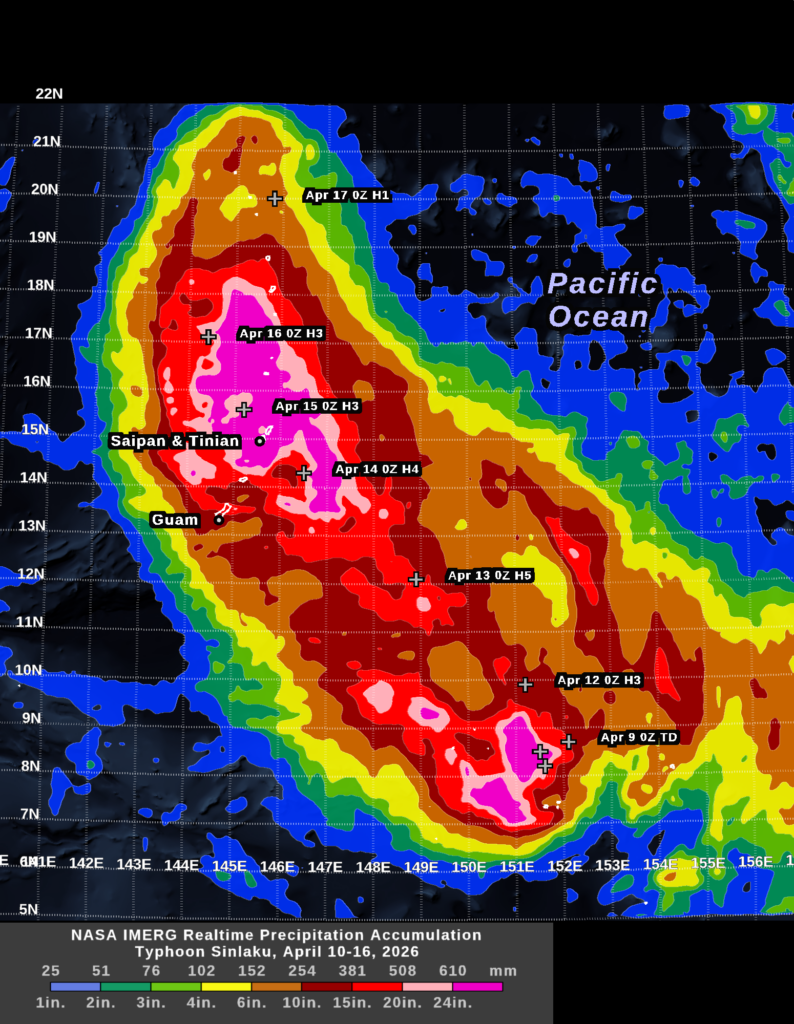
The movie below shows seven days of rainfall from Typhoon Sinlaku. This animation is built up from estimates made every 30 minutes from April 10 through April 16. In this movie, the transparent gray clouds represent Geosynchronous infrared satellite observations and the rainfall rate shown in color comes from NASA’s IMERG algorithm. These IMERG estimates can be viewed in NASA’s RAIN-Global 2 web tool or on the WorldView webpage.

These 30-minute surface rainfall rates can be summed to arrive at the storm-total rainfall accumulation. The public, businesses, and disaster agencies care about storm totals, not just when a storm will hit, so accumulation comes up in weather discussions. At about 2PM EDT (01800 UTC) on April 13, the National Weather Service office for the island of Guam warned the public that Typhoon Sinlaku could bring 15 to 25 inches of rain to the nearby Pacific islands of Saipan and Tinian in the subsequent days.  In its hurricane local statement, the Guam office said that passive-microwave satellite observations influenced their prediction.

The 7-day accumulation shown above is one way to illustrate how the National Weather Service may have arrived at its 15-to-25-inch forecast.  During the two days before Typhoon Sinlaku reached Saipan and Tinian, the IMERG algorithm estimated that the storm was dumping about 6 to 20 inches of rainfall along the portion of its track southeast of these islands. This range is shown in orange and red in the image. The typhoon’s forward speed was cut in half around the time it started impacting Saipan and Tinian, which would increase the time it would spend over these islands. Other factors remaining equal, a slower forward speed would proportionally increase the expected rainfall total. Where the storm center passed with a slow forward motion (during April 14–15), IMERG estimated that the accumulation was 20 to 30 inches (pink and magenta in the image).

In the 7-day accumulation image, the location of Sinlaku’s center is marked with a white plus sign at 0000 UTC, each day. The storm’s strength is indicated by H1 through H5 for categories 1–5 on the Saffir-Simpson scale or by TD, which stands for Tropical Depression.  

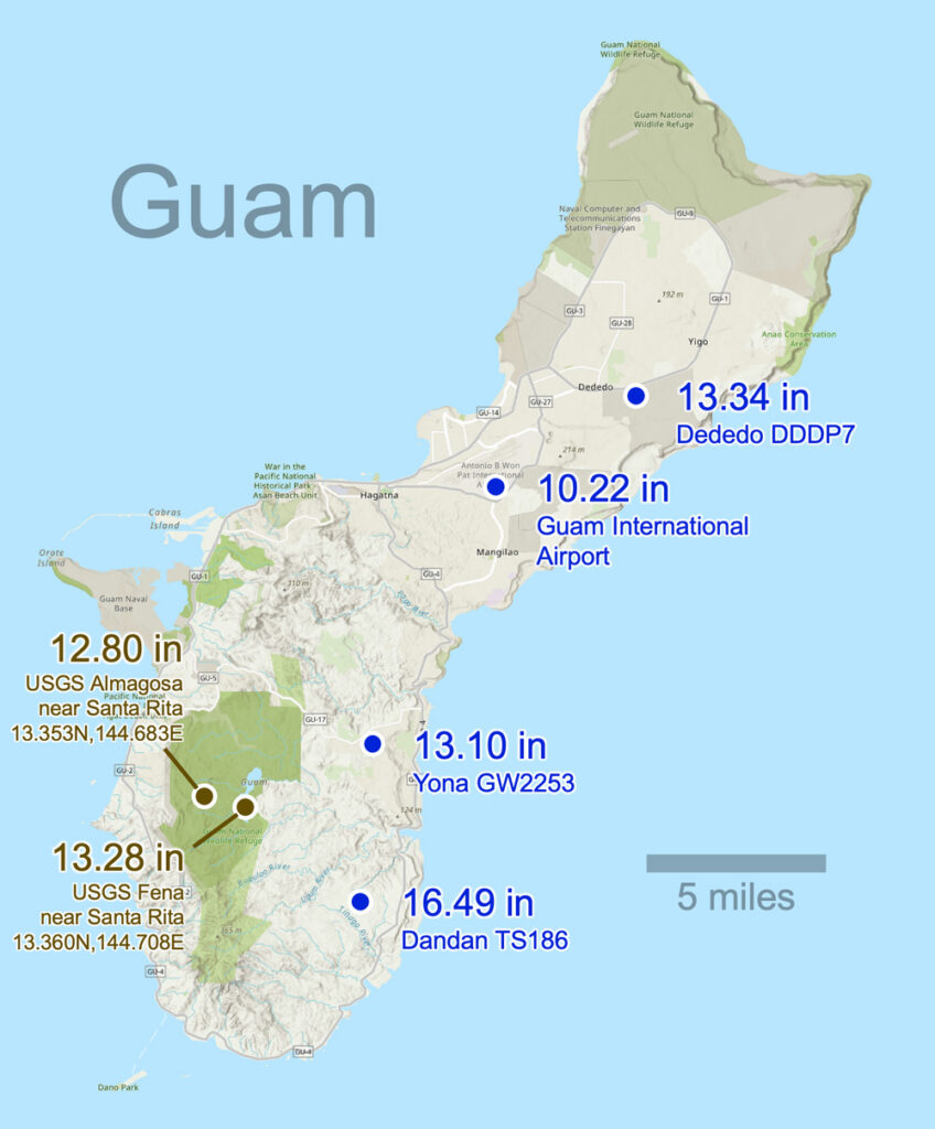
One way to increase confidence in these near real-time IMERG storm totals is to compare them to near real-time rain-gauge observations where available.  Rain-gauge data is not available immediately following Typhoon Sinlaku’s landfall for the two islands most severely impacted, Saipan and Tinian. However, just 130 miles to the south, several rain gauges in Guam continued to operate during the passage of Typhoon Sinlaku.  Between April 9 and 17, the National Weather Service and the USGS reported that six rain gauges in Guam had accumulations of 10.2 to 16.5 inches, respectively, including at Almagosa, Dededo, and Santa Rita. The map below shows the location of these gauges. IMERG reported 10 to 20 inches of accumulation over Guam, which indicates good agreement with these gauges. 

The Third Dimension

NASA’s Global Precipitation Measurement (GPM) Measurement satellite carries a radar built by Japan that is currently the only instrument in space able to observe the three-dimensional structure of storms. A few other cloud or precipitation radars are also in space, but they collect only two-dimensional curtains of data with data collected along the satellite’s direction of motion and vertically. The EarthCare and Tomorrow.IO satellites carry such 2D radars. Other satellite instruments collect different types of 2D data. Passive microwave instruments see into and through a storm, producing an image somewhat like a medical X-ray of the body. Infrared satellite instruments see only the top surface of a storm cloud, something like a hand-held infrared thermometer taking your temperature when pointed at your forehead. 

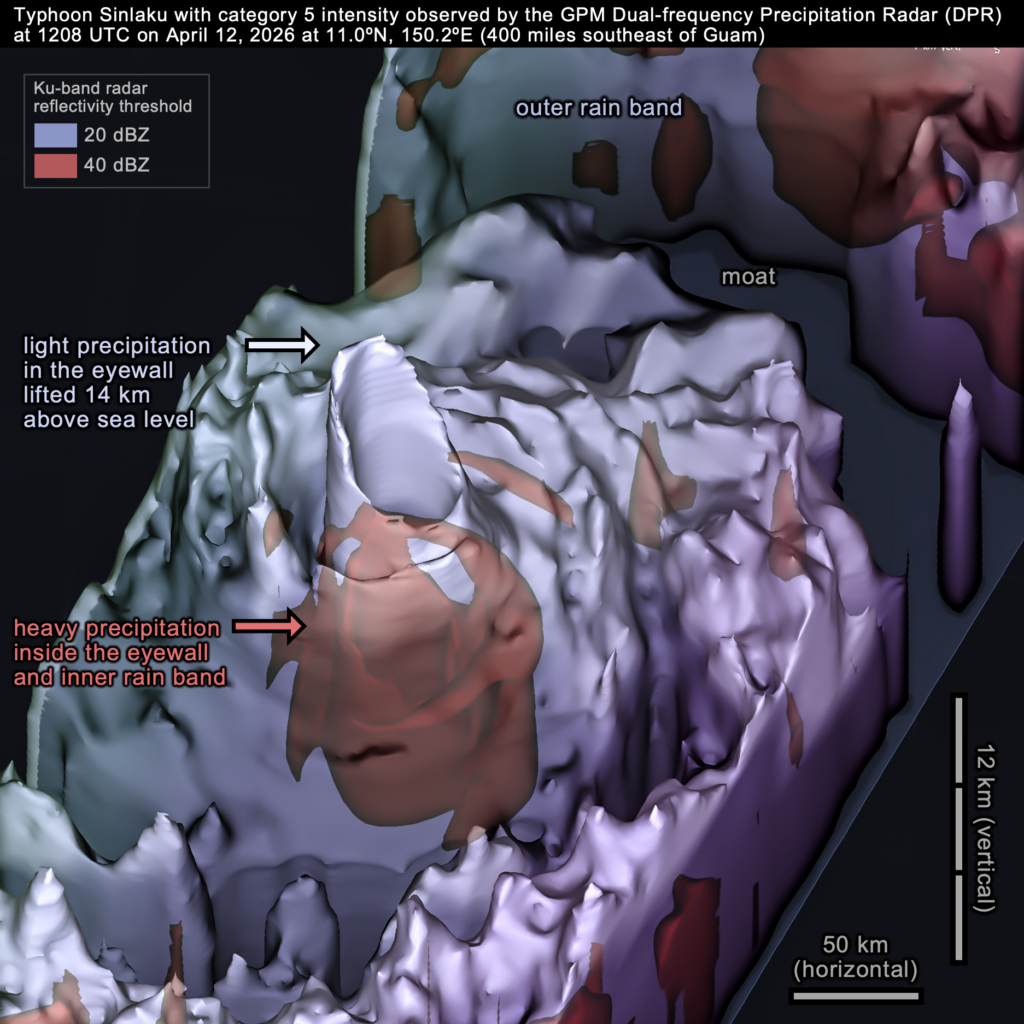
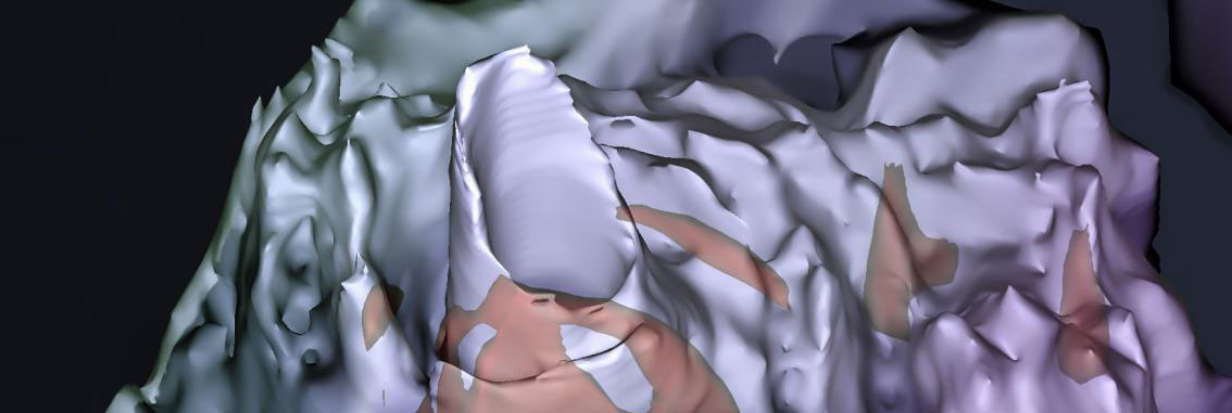
The dual-frequency radar on the GPM satellite flew over Typhoon Sinlaku’s eyewall on April 12, 2026. At 1208 UTC that day, the typhoon had reached category 5 on the Saffir-Simpson scale and would soon reach its peak wind intensity.

Above, the 3D image shows the radar-observed volume of the light precipitation inside Typhoon Sinlaku. Light precipitation is represented by the blue-gray surface. To a first approximation, the precipitation in the lower half of the hurricane (within 5 km of sea level) takes the form of raindrops. Above that, there are various forms of frozen precipitation because the atmosphere is so cold at those altitudes. The blue-gray surface is defined by a 20-dBZ radar-reflectivity threshold. Inside this surface, there is in inner volume of heavy precipitation that the image shows in red. The inner volume is defined by a stronger radar signal, i.e., a 40-dBZ threshold. Generally speaking, a radar signal this strong indicates heavy rainfall or large ice hydrometeors coated in liquid water as they fall through warm air.

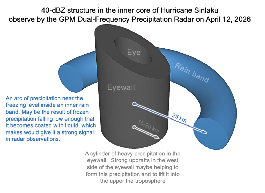
One can gather clues about the updrafts and precipitation processes at work in the inner core of Typhoon Sinlaku by studying the shape of the radar echoes inside it. The following schematic diagram provides one interpretation of the 40-dBZ signal that the GPM DPR observed.

CEOSR at George Mason University assists the GPM science team with examining major precipitation events and evaluating and running precipitation-estimation algorithms. For more information about the GPM satellite and the IMERG algorithm, visit the GPM website: https://gpm.nasa.gov. Images and story by Owen Kelley (CEOSR). Animation by Jason West (NASA/PPS/KBR).


Large rainfall accumulation from Hurricane Melissa (2025)

Published October 29, 2025
Updated October 31, 2025

Hurricane Melissa Impacts Jamaica

An international constellations of satellites observed Hurricane Melissa as it passed over Jamaica on Tuesday, October 28, 2025.

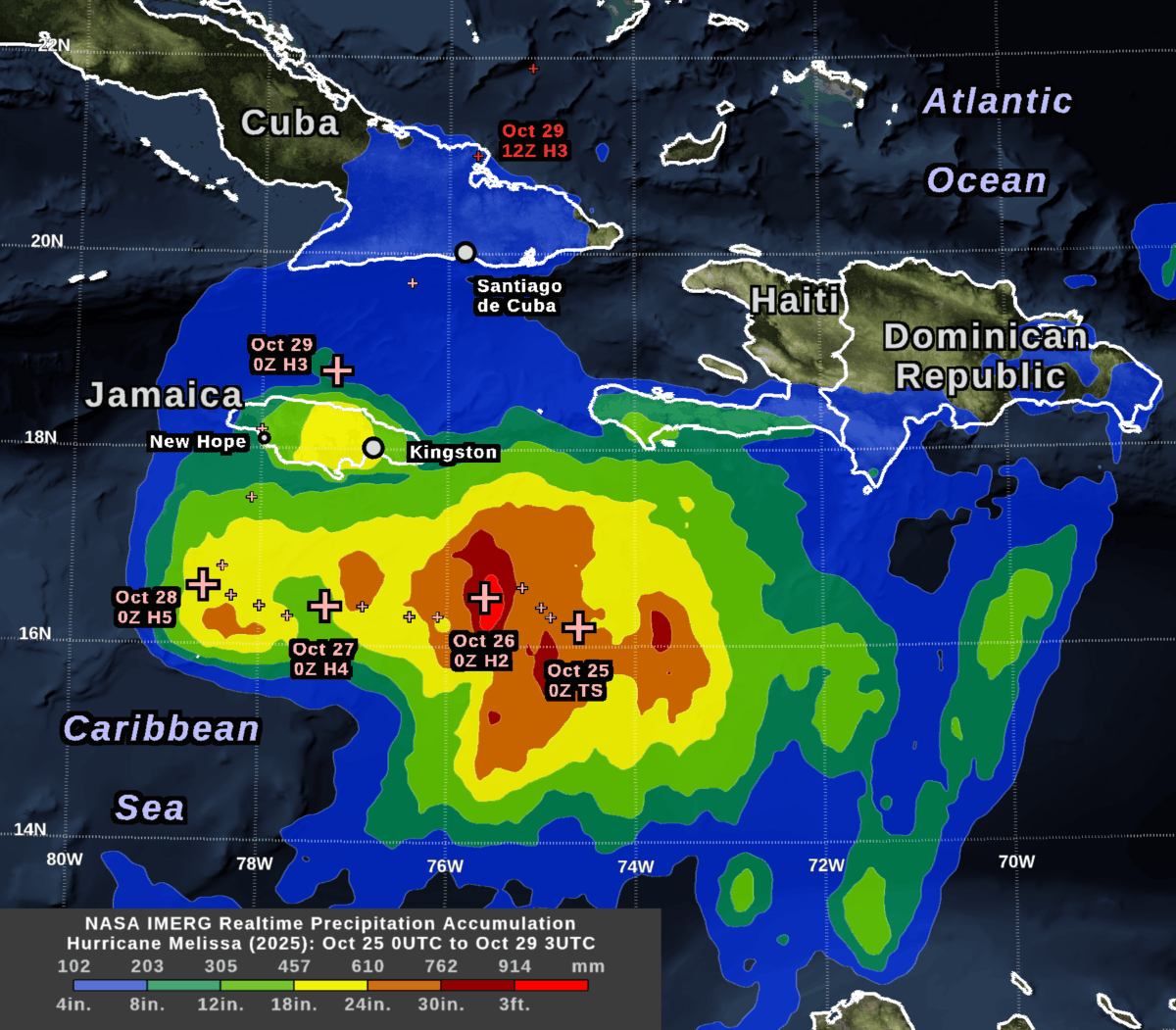
NASA’s IMERG algorithm combined rainfall estimates from these satellites in an effort to create the best possible estimate of rainfall in near real-time. IMERG stands for Integrated Multi-satellitE Retrievals for Global Precipitation Measurement (GPM). The image shows the depth of rain that IMERG estimated over land and sea during a little more than four days: 8PM EST October 24 to 11PM EST October 28 (in universal time, 0000 UTC on the 25th to 0300UTC on the 29th).

A day before landfall, the National Hurricane Center (NHC) forecast that the hurricane would dump 20-30 inches of rain on parts of Jamaica. This large amount of accumulation was expected because the storm was strong (category 5 on the Saffir-Simpson scale), the hurricane’s center was slow moving, and Jamaica has a mountain range oriented perpendicular to the flow of moist, oceanic air that the hurricane would force over the island.

The NHC rainfall forecast turned out to be broadly consistent with the near real-time IMERG estimates that were based on satellite observations.

By examining this storm and other severe weather events, researchers at George Mason’s Center for Earth Observing and Spatial Research (CEOSR) assist the team of scientists who develop the IMERG algorithm. This work is funded by NASA’s Goddard Space Flight Center. It includes helping to test new versions of the algorithm and searching for anomalies in the current version.

IMERG estimated that central Jamaica received 18-24 inches of rainfall during October 26-28, most of which occurred during October 28. This region is the yellow area over central Jamaica in the accumulation image at the top of this post, which can also be downloaded here.

During the preceding 48 hours, the center of Hurricane Melissa had stayed about 100 km south of Jamaica while it strengthened from category 2 to 5 and traveled slowly west. The plus signs in the accumulation image indicate the NHC’s estimate of the location of Hurricane Melissa’s eye every six hours.

The largest rain accumulations during this approximately 3-day-long period were over the ocean southeast of Jamaica, where IMERG estimated over 3 feet of rainfall. In the image at the top of this post, this region is show in bright red. The large accumulation there was caused by a combination of factors, including that rainfall was plentiful as the storm intensified over that location during October 26. Additional rain fell at this location after the hurricane eye had moved west because of a persistent precipitation feature that tracked to the east of the hurricane’s eye.
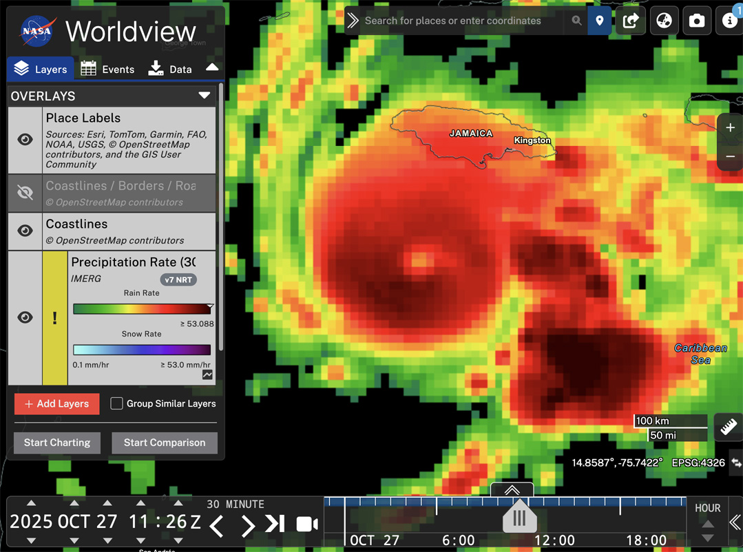
Hurricane Melissa (2025) in NASA WorldView (Oct. 27 1100UTC)

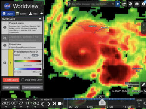
Snapshot of the IMERG rainfall rate estimate for Hurricane Melissa during 7:00-7:30 AM EDT on October 27, 2025 (1100-1130 UTC) . 

In the image above, this persistent stormy area east of Melissa is indicated with the arrow in the 30-minute precipitation-rate image. This image was captured from NASA’s Worldview web page. This image shows data from 16 hours before Melissa made landfall in Jamaica at approximately 1PM EDT (1700 UTC on October 28) according to the National Hurricane Center.  You can view a higher resolution version of this image here or interactively explore this data by following this link to Worldview.

Melissa Before and After Impacting Jamaica

The evolution of Melissa’s rainfall pattern can be tracked with the estimates available every 30 minutes from the IMERG algorithm. These estimates cover the globe with a resolution of approximately 7 miles (i.e., each grid box covers 0.1 degrees of latitude and longitude).

For October 23 through 29, the animation below shows heavy rainfall in dark red and cloud cover in shades of gray.

Animation of rainfall from Hurricane Melissa during October 23-29, 2025, as estimated by the IMERG algorithm. 

On October 23, Melissa was a tropical storm southeast of Jamaica with sustained heavy rainfall in excess of 25 mm/hr.  Smaller areas of heavy rainfall persisted after Melissa passed over Jamaica on October 28. They were mostly absent after Melissa traveled north of Cuba the next day.

At the end of the movie, the rain rates are hidden and the total 7-day rainfall accumulation is show in a green-purple color table. Despite the relatively lower rain rates over Cuba, total accumulations over eastern Cuba were still estimated to exceed 11.8 inches (300 mm) in some locations by the end of the day on October 29. These areas are shown in light purple. Accumulations in excess of 19.7 inches (500 mm) are shown in dark purple, and include large areas of the Caribbean Sea as well as central Jamaica.

When no satellite observations are available for a particular location and half-hour period, IMERG morphs satellite-observed precipitation from earlier or later times along the direction of the prevailing winds.

IMERG is ideal for monitoring hurricanes and other weather events that travel over land and ocean. Rainfall forecasts are available over the whole globe, but there are no rain gauges or weather radars nearby over the great majority of the ocean, so it is difficult to estimate how much rain actually falls there. Even over land areas with rain gauges, these measurements may not be available immediately after a storm strikes when disaster response must be organized.

For More Information

For more information about the IMERG algorithm, visit the website of NASA’s Global Precipitation Measurement (GPM) Mission. The Precipitation Processing System (PPS) at NASA Goddard runs the IMERG algorithm and distributes the data products.

Credits: Animation created by Jason West (KBR). Images created by Owen Kelley (GMU). Caption by Owen Kelley and Jason West.


Global Rainfall at Your Fingertips

CEOSR personnel working at NASA’s Precipitation Processing System (PPS) have generated 27 years of global rainfall imagery that is now available in NASA Worldview, which is NASA’s online archive of Earth science imagery.

NASA’s Worldview website now allows you to explore global estimates of rainfall and snowfall from 1998 to the present at 30-minute intervals. Researchers and application developers have been using this dataset since 2014 (Portier 2024; Portier et al. 2023), but now it is also available as images in Worldview.

This precipitation dataset is called IMERG, which stands for Integrated Multi-satellitE Retrievals for Global precipitation measurement (GPM). Over the years, a team of NASA scientists have improved the IMERG algorithm’s accuracy over land and ocean (Huffman et al. 2023a,b,c).

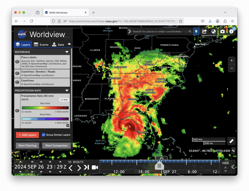
Worldview is now being updated every hour with the most recent global IMERG estimates. Worldview is a user-friendly website for visualizing many of NASA’s Earth science datasets. The image below shows the precipitation falling from Hurricane Helene shortly before it made landfall in Florida in September 2024 (West et al. 2024). In the image, you can see how the IMERG estimates cover land and also ocean where there are no rain gauges or ground radars.

Hurricane Helene, 30-minute precipitation, 26 Sept 2024 at 23 UTC
An IMERG snapshot of the precipitation falling from Hurricane Helene as displayed in NASA’s Worldview website. The estimate covers a 30-minute period near the end of September 26, 2024.

NASA runs the IMERG algorithm three times for each 30-minute period. The precipitation estimates from the first run become available just 5 hours after satellite observations are made, and that run is called Early IMERG. This near real-time dataset is useful for forecasting floods and monitoring large storm systems. A second run, called Late IMERG, occurs about 15 hours after observations are made. About four months later, the IMERG algorithm is run one last time when more observations and calibration datasets are available as inputs. This last run is called Final IMERG. Final IMERG is useful for studying droughts and other seasonal deviations from normal conditions. It can also be used for post-season reexamination of major events such as hurricanes. The Worldview website displays Final IMERG when available and Early IMERG otherwise.

Worldview for Beginners

If you haven’t used NASA’s Worldview website before, it is easy to learn how. Start by visiting https://worldview.earthdata.nasa.gov. There is no App to download, no user registration, and no charge.

When you visit Worldview, it initially loads satellite imagery of the most recent observations of the Earth’s surface and clouds. Precipitation is not initially displayed.

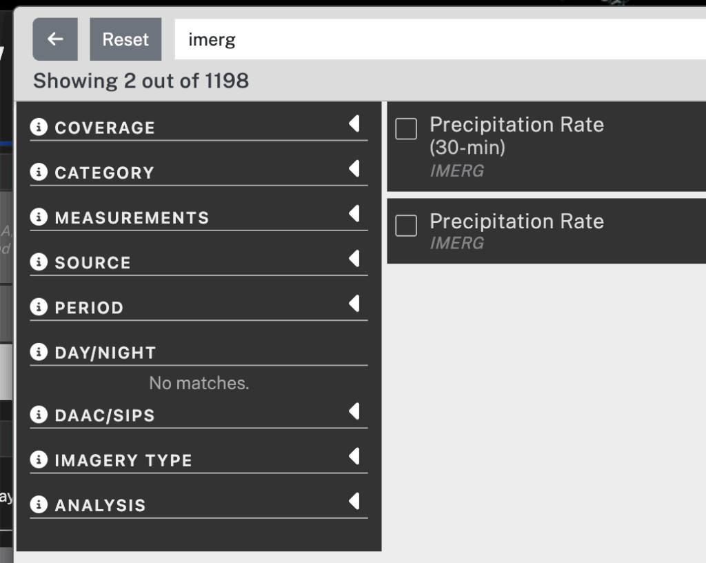
It takes two steps to display IMERG precipitation in Worldview. The first step is to add to your session the Worldview layer that contains 30-minute IMERG precipitation estimates. To do so, click the Add Layer button in the lower left corner. In the panel that pops up, type “imerg” in the search field. In the search results, check the box next to the entry for 30-minute IMERG. To dismiss the Add Layer panel, click the “X” symbol in the upper right.

Worldview Add Layer panel
The Add Layer panel in Worldview.

The second step is to move a few hours into the past.  To do so, you can move the time slider a little to the left in the timeline along the bottom of the Worldview window. Alternatively, you can use the arrow icons to move the clock display back a few hours. This time adjustment is necessary because IMERG precipitation estimates are created approximately 5 hours after satellite observations are made and it takes another hour or so to convert the data into Worldview imagery.

Worldview time bar
The date-time selection interface along the bottom of the Worldview window.

The 30-minute IMERG imagery should now be visible with green-yellow-red colors for rainfall estimates and cyan-blue-purple colors for snowfall estimates. To adjust the map’s zoom level, use the plus and minus buttons in the Worldview window or the scroll wheel on your mouse if you have one. To change the map’s location, drag the map with your mouse. By default, Worldview shows coastlines. For more detailed political boundaries and place labels, turn on optional layers. These optional layers can be found at the top of the layer list on the left side of Worldview.

The IMERG algorithm estimates the precipitation rate at the middle of each 30-minute period, i.e., 15 minute and 45 minute after the hour. The units of precipitation rate are the millimeters of rain-equivalent depth that would accumulate in an hour if the observed precipitation rate (rainfall or snowfall) were to persist for a full hour. If the precipitation is frozen, then the value that IMERG reports is the depth of liquid water that would result if the frozen precipitation were melted before its depth is measured. The liquid-equivalent depth of snowfall is relevant to the water storage in snowpack, which influences how much water will become available to plants once the snow melts. Because fresh snow contains air (i.e., it’s fluffy), about 4 to 20 inches of snowfall will melt down to just an inch of liquid water (Baxter et al. 2005).  IMERG states the liquid-equivalent depth of snowfall, but most weather reports state the depth of snowfall in its original, frozen form. 

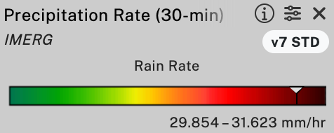
One advantage to viewing IMERG precipitation imagery within Worldview is that one can hover over an image in Worldview to obtain a numerical range for the precipitation rate represented by that pixel of the image. The numerical range is displayed in the color bar on the left side of the browser window. This color-table-interrogation feature is available only if you are using a device with a mouse that can hover, such as a laptop or desktop but not a mobile device.

Worldview rain color bar
The Worldview color bar for rainfall. The downward-pointing white triangle indicates the color of the pixel in the IMERG image that is currently under the mouse pointer. The numerical range below the arrow is the range of precipitation rates associated with that color.

If you encounter any trouble downloading IMERG data, contact the GPM project using the contact page.

Credits: Story and visualization by Owen Kelley.

References

Baxter et al., 2005: A Climatology of Snow-to-Liquid Ratio for the Contiguous United States. Weather and Forestcasting, 20, 729–744, Figs. 3 and 5.

Huffman, G. J., D. T. Bolvin, D. Braithwaite, K. Hsu, R. Joyce, C. Kidd, E. J. Nelkin, S. Sorooshian, J. Tan, and P. Xie, 2023a: NASA Global Precipitation Measurement (GPM) Integrated Multi-satellitE Retrievals for GPM (IMERG) Version 07, Algorithm Theoretical Basis Document (ATBD). https://arthurhou.pps.eosdis.nasa.gov/Documents/IMERG_V07_ATBD_final.pdf.

Huffman, G. J., D. T. Bolvin, R. Joyce, O. A. Kelley, E. J. Nelkin, J. Tan, D. C. Watters, and B. J. West, 2023b: Integrated Multi-satellitE Retrievals for GPM (IMERG) Technical Documentation. white paper, https://arthurhou.pps.eosdis.nasa.gov/Documents/IMERG_TechnicalDocumentation_final.pdf.

Huffman, G. J., D. T. Bolvin, R. Joyce, O. A. Kelley, E. J. Nelkin, J. Tan, D. C. Watters, and B. J. West, 2023c: IMERG V07 Release Notes. white paper, https://arthurhou.pps.eosdis.nasa.gov/Documents/IMERG_V07_ReleaseNotes_final.pdf.

Portier, A., 2024: Using GPM Precipitation Data to Help Inform Decisions and Policies Throughout the Globe. GPM 10-in-10 Webinary Series: Application, NASA, https://www.youtube.com/watch?v=NPg_2H-XxR4.

Portier, A., D. Kirschbaum, M. Gebremichael, E. Kemp, S. Kumar, I. Llabres, E. Snodgrass, and J. Wegiel, 2023: NASA’s Global Precipitation Measurement Mission: Leveraging Stakeholder Engagement & Applications Activities to Inform Decision-making. Remote Sensing Applications: Society and Environment, https://doi.org/10.1016/j.rsase.2022.100853.

West, J., S. Lang, and J. Reed, 2024: Powerful Hurricane Helene Makes Landfall in Florida’s Big Bend. GPM website, https://gpm.nasa.gov/applications/weather/news/powerful-hurricane-helene-makes-landfall-floridas-big-bend.


Hurricane John Gives Southern Mexico a Surprise One-Two Punch

On Monday evening, Sept. 23, 2024, an unusual hurricane struck southern Mexico, dumping 20 inches of rainfall along the coast according to estimates from NASA’s IMERG precipitation product.  The following image shows these rainfall estimates.

Hurricane John (2024) rainfall accumulation

Observations from an international constellation of satellites were the starting point for calculating these estimates, and the data confirm that forecasters in prior days were right to warn of possible heavy rainfall. Forecasters did have trouble predicting the storm’s track and intensity, though. In the rural area of southwestern Mexico where Hurricane John struck, there are few rain gauges that provide public data in real-time, so having calibrated multi-satellite near real-time precipitation estimates like IMERG available is particularly valuable for understanding this storm as it unfolded. 

The contours in the image cover the areas where the IMERG algorithm estimated that 5 inches (blue) to 36 inches (bright red) of rainfall fell during a four-and-a-half-day period ending on Friday, Sept. 27, at 3 a.m. CST (0900 UTC). The dashed yellow line in the image shows the U.S. National Hurricane Center’s estimate of the path taken by the storm’s low-pressure center.

According to NOAA hurricane track data, approximately once a year during the past 50 years, one major hurricane over the eastern Pacific has passed within 800 miles of this part of southern Mexico. Almost all of these hurricanes moved roughly west over the ocean, parallel to the coast. Before Hurricane John this year, only two other times during the past 50 years has a major hurricane made landfall within 150 miles of where Hurricane John hit Mexico on Monday. On Sept. 23, John made landfall near the small, coastal village of Punta Maldonado, which is located about 100 miles east of the town of Acapulco. The two other hurricanes that had made landfall in the same region in prior years were Hurricane Pauline in 1997 and Hurricane Otis in 2023.

John was just a 40-knot tropical storm at 3 a.m. CST on Monday, and forecasters had only expected it to become a slightly stronger tropical storm during the following 24 hours before making landfall and dissipating. Instead, John experienced extremely rapid intensification to become a 105-knot Category 3 hurricane on the Saffir-Simpson scale. This intensification occurred during a period that was merely 18 hours long, immediately before landfall. Following landfall, societal impacts were moderated by the fact that the storm hit a low-population region of Mexico.

According to the National Hurricane Center, John made landfall around 9:15 p.m CST in Mexico on Monday evening (Sept. 23, 2024), which was 0315 UTC on Tuesday morning, Sept. 24, in universal time.

On Tuesday, Sept. 23, Hurricane John was forecast to dissipate over land, and for part of Tuesday, the National Hurricane Center stopped issuing advisories for it. However, the storm’s remnants moved over the Pacific Ocean again where the system regained hurricane strength (65-knot winds) by Thursday, Sept. 26. The next day, John weakened to tropical-storm strength before striking Mexico a second time at a location west of its first landfall earlier in the week.

For more information about the IMERG algorithm and the NASA Global Precipitation Measurement (GPM) mission that IMERG is part of, please visit the GPM website: https://gpm.nasa.gov. Credits: Image and caption by Owen Kelley.

References:

NOAA Historical Hurricane Tracks webpage, https://coast.noaa.gov/hurricanes.

NHC, Discussion #3, https://www.nhc.noaa.gov/archive/2024/ep10/ep102024.discus.003.shtml. Intensity was 40 kt at 3AM CST on Monday, Sept. 23, 2024. Intensity was forecast to increase 20 kt in the following 24 hours.

NHC, Discussion #7, https://www.nhc.noaa.gov/archive/2024/ep10/ep102024.discus.007.shtml. Intensity increased to 105 kt, making John category 3 as of 9PM CST Monday, Sept. 23. The intensity estimate was influence by passive-microwave satellite data (SSMIS) and by T-values from infrared geosynchronous satellite data.

NHC, Discussion #8, https://www.nhc.noaa.gov/archive/2024/ep10/ep102024.discus.008.shtml. Landfall time was 9:15PM CST Monday, Sept. 23, with 105-kt category-3 winds. This time is the same as 0315 UTC, Tuesday, Sept. 24, 2024.

NHC, rain potential images, posted on https://www.nhc.noaa.gov. These images were issued between Sept. 23, 2024, 1200 UTC and Sept. 25, 2024, 1530 UTC. These images showed a narrow area with 20-30 inches of 3-day rainfall accumulation along the coast of the Mexican states of Oaxaca or Guerrero.


Hurricane Debbie (2024) Stalls off the Coast of South Carolina

Hurricane Debby precipitation accumulation 12UTC 3 Aug to 0UTC 9 Aug 2024
Hurricane Debby’s rainfall accumulation During August 3-9, 2024

Since 2014, NASA has run the IMERG multi-satellite algorithm to estimate how much precipitation falls over the globe every 30 minutes on a grid with 0.1-degree resolution in latitude and longitude. Each grid box is approximately a square seven miles to a side at the Equator.

Every few years, the team of scientists that develop the IMERG algorithm deliver a new version of the software. They give the algorithm code to the NASA Goddard Precipitation Processing System (PPS) to run. Analysts and computer programmers with George Mason University’s CEOSR assist with running the algorithm and detecting anomalies in its output. When a new version of IMERG is delivered, NASA goes back over 23 years of satellite observations to give updated precipitation estimates that cover every 30 minutes of that entire period.

In 2024, NASA released Version 7 of the IMERG algorithm. An example accumulation from this version of the algorithm is shown above, covering five and a half days of observations of Hurricane Debby. Debby impacted the United States East Coast in August 2024. For part of that time, Debby was stalled off the coast of South Carolina, which means that the hurricane brought on shore a great deal of moisture which fell as large rainfall accumulations.

CEOSR team members used ancillary datasets to help evaluate the quality of the IMERG precipitation accumulations of Hurricane Debbie. The red triangles are locations of preliminary tornado reports associated with Hurricane Debbie according to the NOAA Storm Prediction Center. The violet-colored bow ties are locations where the USGS measured major
flooding at a steam gauge, as reported by the NOAA Water Prediction System. The orange and red squares are locations where rain gauges measured accumulation in excess of 14 or 17 inches, respectively. These gauge data were published in a discussion by the NOAA Weather Prediction Center.

The image’s filled contours in the image show precipitation estimates from the near real-time run of Version 7 IMERG. These near real-time estimates are known as the Late IMERG run. Weather forecasting agencies, disaster management organizations, and researchers can download these estimates approximately 16 hours after the satellite observations were collected. The path taken by the low-pressure center of Hurricane Debby is show with the white dashed line as reported in real-time by the National Hurricane Center.

As can be seen in the image, the maximum accumulation reported by the rain gauges occurred mostly over South Carolina within 50 miles of the coast. Many of the tornadoes and flooding stream gauges were also located this close to the sea. In contrast, the near real-time accumulations from IMERG were largest further inland or off the coast.

Because IMERG relies heavily on satellite estimates, it does not always capture the fine-scale structure of precipitation from severe storms with sharp precipitation gradients. Over much of the world’s oceans and even parts of continents, ground-based precipitation estimates are sparse, so there is interest in improving the IMERG algorithm based on comparisons with ground data where plentiful, such as over much of the United States.

CEOSR researcher Owen Kelley examined Version 7 IMERG accumulations from other hurricane impacting the United States coast in prior years to see if the new Version 7 algorithm always has errors matching the spatial pattern seen here with Hurricane Debby (2024). He determined that the new algorithm does not habitually make this mistake. NASA and CEOSR researchers will continue to evaluate the new version of IMERG with the aim of helping NASA to release an improved version in approximately 2 years.

Hurricane Ian Crosses Florida and Heads Toward South Carolina

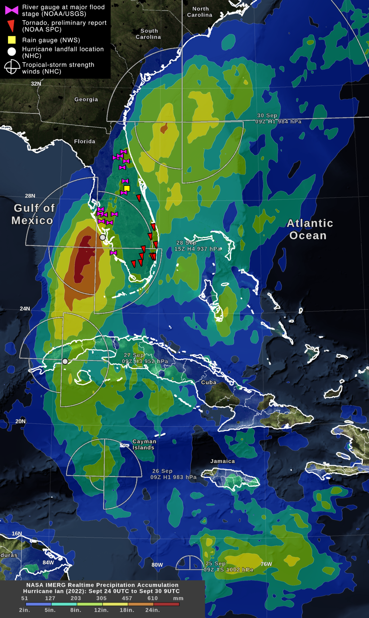
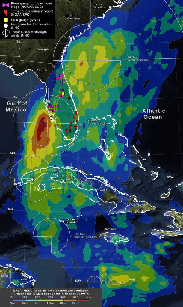
Hurricane Ian’s rainfall accumulation up to 5AM EDT on September 30, 2022

As Hurricane Ian impacts Florida and South Carolina, NASA IMERG algorithm provides estimates of Ian’s rainfall over both land and sea. CEOSR team members assist NASA with visualizing this data and with monitoring the performance of the IMERG algorithm. Such evaluations assist with improving the algorithm, a new version of which is due to be released later this year or in early 2023.

The image above shows the rainfall accumulation from Hurricane Ian from when it formed in the Caribbean on September 25, 2022, through when it approached the coast of South Carolina on September 30. On September 28 and 29, Ian cross Florida going west to east from Ft. Myers to Cape Canaveral.

The image also show the locations of tornadoes and river flooding in Florida that were associated with the passage of Hurricane Ian. There were preliminary reports of tornadoes over southern Florida the night before Ian’s Florida landfall, which are marked by red triangles in the image. The tornadoes were associated with a large, persistent band of heavy rain that maintained a position
to the east of Hurricane Ian’s inner core during the days prior to the Florida landfall.

On September 29, the day Ian left Florida, numerous USGS stream gauges reach major-flood stage, meaning significant economic damage was expected. These stream gauges are marked with purple
bows in the image. Florida’s inland flooding was caused by Ian’s heavy rainfall. Along the coast, storm surge contributed to the height of the flood water.

Lightning before Landfall

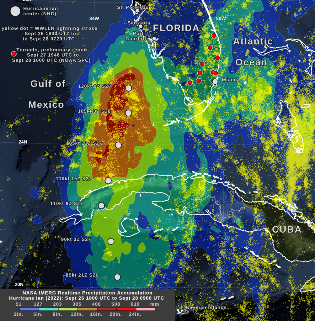
Prior to making landfall in Florida on September 28, Hurricane Ian intensified over the Gulf of Mexico. During this time, its inner core dropped a considerable amount of rain and also exhibited many lightning flashes. This period is show in the image below.

Hurricane Ian’s rainfall accumulation during its approach to landfall in Florida

In the Gulf of Mexico, Ian’s eyewall was seen to contain particularly vigorous storm cells. Lightning was observed in Ian’s eyewall, whereas lightning had been near absent from Ian’s eyewall prior Ian passing over Cuba. Lightning strokes from the World Wide Lightning Location Network (WWLLN) are displayed in the image as small yellow dots. Over the Gulf of Mexico, the period of active eyewall lightning can be identified using the white dots in the image that indicate six-hourly locations of Hurricane Ian’s low-pressure center, as estimated by the National Hurricane Center.

Once in the Gulf of Mexico, Hurricane Ian intensified and underwent an eyewall replacement cycle early on September 28, according to the National Hurricane Center. During this period, NASA’s IMERG algorithm estimates that the rainfall accumulation under Ian’s inner core reached 12 to 20 inches. This accumulation is much higher than the 5-to-12-inch accumulation that Ian’s inner core had produced the day before, when the storm was located south of Cuba.

On September 27, stretching for several hundred miles to the east of Hurricane Ian’s inner core was a band of heavy rain storms and thunderstorms. These storms are seen in the IMERG rainfall accumulation, covering the southern tip of Florida during this period. During the night of September 27 and morning of September 28, these storms spawned a number of tornadoes according to preliminary reports from NOAA. These tornadoes are displayed as red dots in the image.

Credits: WWLLN data from the University of Washington with support from Jeremy Thomas and Natalia Solorzano at DigiPen Insitute of Technology and NorthWest Research Associates. Visualization Owen Kelley (CEOSR/NASA).

Hurricane Fiona from Caribbean to Canada

Hurricane Fiona and Its Landfall in Canada
Hurricane Fiona and Its Rainfall in Canada

Rainfall In Nova Scotia, Canada

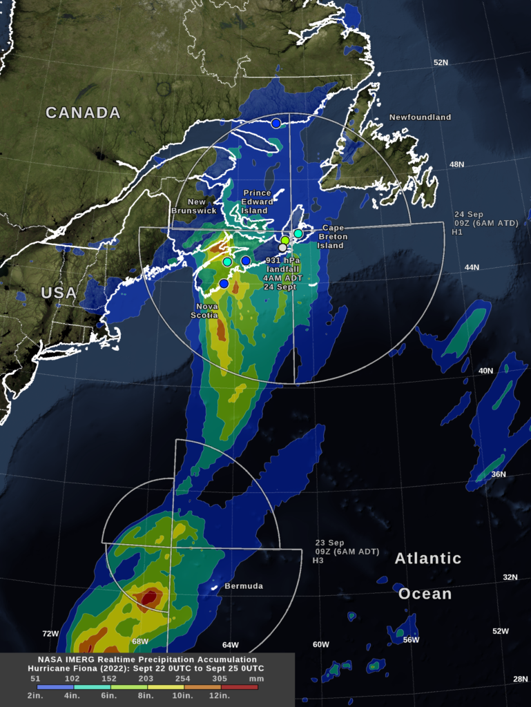
CEOSR team members tracked Hurricane Fiona as it approached Canada in September, 2022. One of the tools they used was NASA’s IMERG algorithm, which provides estimates of global rainfall rates every 30 minutes with 0.1 degree latitude-longitude resolution. IMERG estimates of Hurricane Fiona’s rain accumulations in Nova Scotia were similar but somewhat lower than rain-gauge accumulations for the event. IMERG’s rainfall estimates are only approximate because they rely on morphing satellite microwave observations and on more frequent but less direct estimates of rainfall based on satellite infrared observations. None the less, over the open ocean, IMERG’s precipitation estimates are among the best available because the ocean is none instrumented with rain gauges or ground radars.

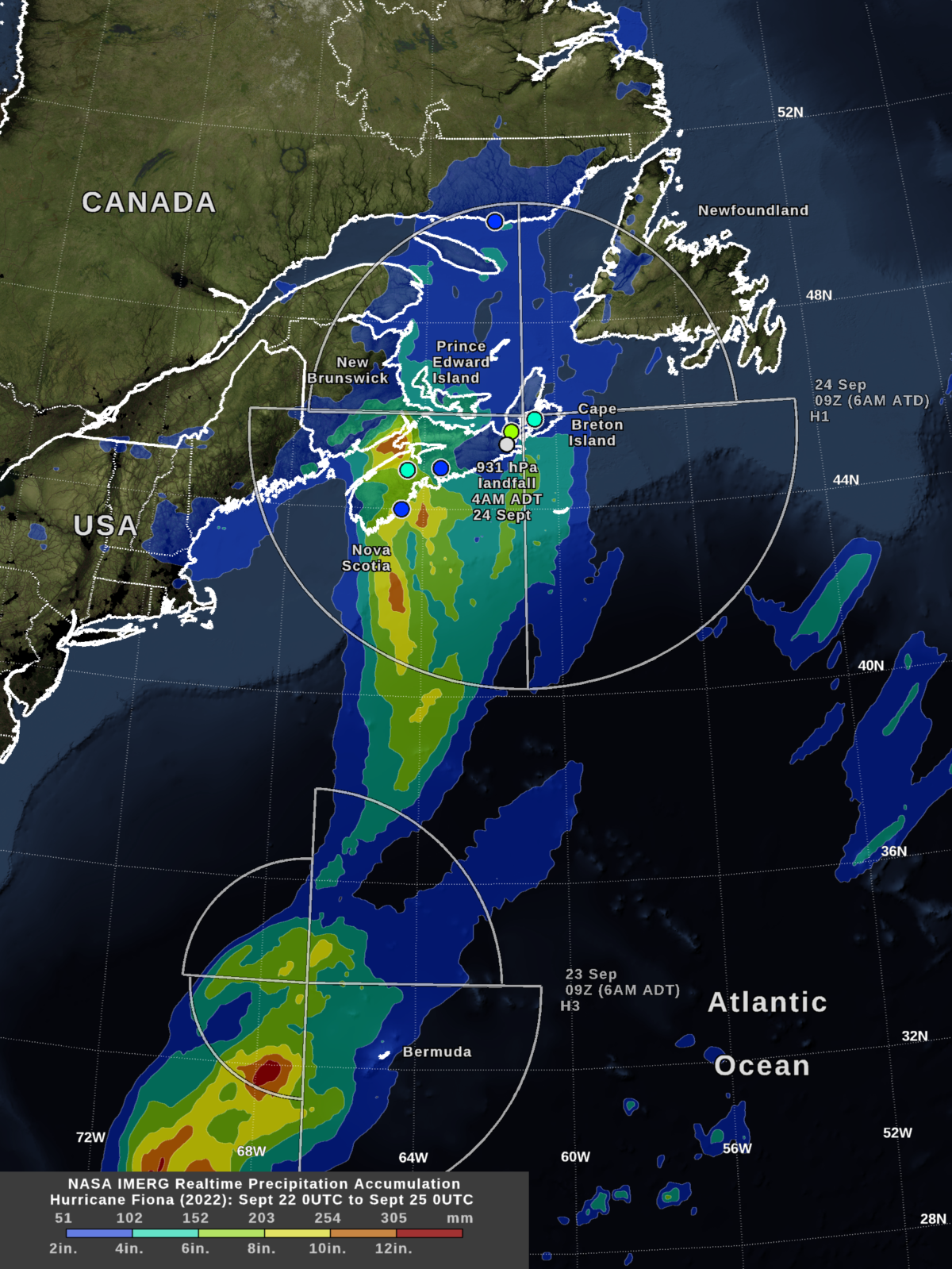
At approximately 4 AM local time (Atlantic Daylight Time) on Saturday, Sept. 24, Hurricane Fiona made landfall in Canada with a surface pressure of only 931 hPa at its center according to the National Hurricane Center (NHC). By 6 AM that morning, the NASA IMERG algorithm estimated that Hurricane Fiona had dropped in excess of 6 inches of rainfall off the coast of Nova Scotia. Rain was still accumulating over Atlantic Canada at that time. The image below shows these IMERG rainfall estimates and the NHC estimate of the distance that tropical-storm strength winds (39 mph, 34 knots) extend from the hurricane’s center.

Fiona’s 3-day rainfall accumulations in Canada were generally in the 2-to-8-inch range, according to rain-gauge data provided by the Canadian government: historical data. Selected gauges are shown in the image using circles that are color-coded with the same color table as the IMERG data. The IMERG-estimated 3-day accumulation over Nova Scotia is, for the most part, in the same 2-to-8-inch range as the rain-gauge data.

On September 23, which was one day before the Canadian landfall, IMERG estimated higher rainfall totals of over 12 inches when Hurricane Fiona passed near Bermuda. The storm was moving forward more slowly at that time, which increased rainfall totals. Rainfall totals were even higher when Hurricane Fiona passed through the Caribbean, as described in the section below.

September 23, a north-south-oriented cold front moved east off the shore of New England and the US Mid-Atlantic region. Rain and thunderstorms associated with that cold front are seen in the IMERG rainfall image, specifically along the coast of Maine and Massachusetts. The blue contour indicates 2-to-4-inch accumulation from the cold front along the Maine coast.

Rainfall in the Caribbean

Hurricane Fiona (2022) in the Caribbean Sea

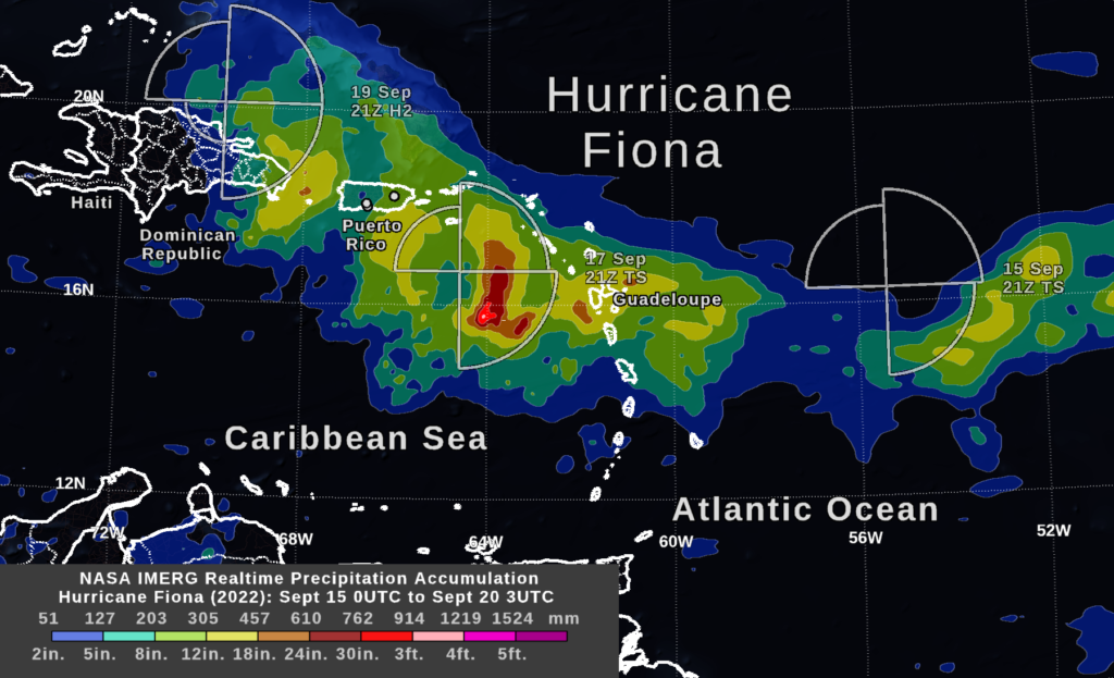
Between Sept. 16 and 19, 2022, Hurricane Fiona struck Guadeloupe, Puerto Rico, and the Dominican Republic. NASA estimated precipitation in the region in near real-time using data from an international constellation of satellites processed by the IMERG algorithm.

IMERG estimated that Fiona dropped 12 to 18 inches of rainfall over Guadeloupe and over the ocean just south of Puerto Rico. Media sources and the National Weather Service reported that heavy rainfall accumulation extended somewhat further north, exceeding 20 inches over part of southeastern and central Puerto Rico.  Some locations with particularly high accumulation from the storm are indicated with white dots in the image.

IMERG’s strength is its global reach, including regions of land and ocean where ground-based weather radar data is unavailable. Where ground radar or rain gauges are present, they may do better at capturing small, intense rain cells and the local effects of mountainous terrain. These strengths and limitations are illustrated by IMERG’s ability to depict Fiona’s full swath of rain across the Atlantic and its underestimation in Puerto Rico.

The National Hurricane Center reported that tropical-storm strength winds extended out from the center of the storm at the distances indicated in the three wind figures shown in the image.  At the first two times shown (September 15 and 17), Fiona was a tropical storm with maximum sustained surface winds 39-73 mph. By September 19, Fiona had strengthened to a category-2 hurricane (96-110 mph winds). 

Credits: Visualization by Owen Kelley (CEOSR/NASA).

Two Weeks of Heavy Rain and a Year of Drought Over Parts of China (July 2021)

China storms and drought (July 2021)
Larger image: click here

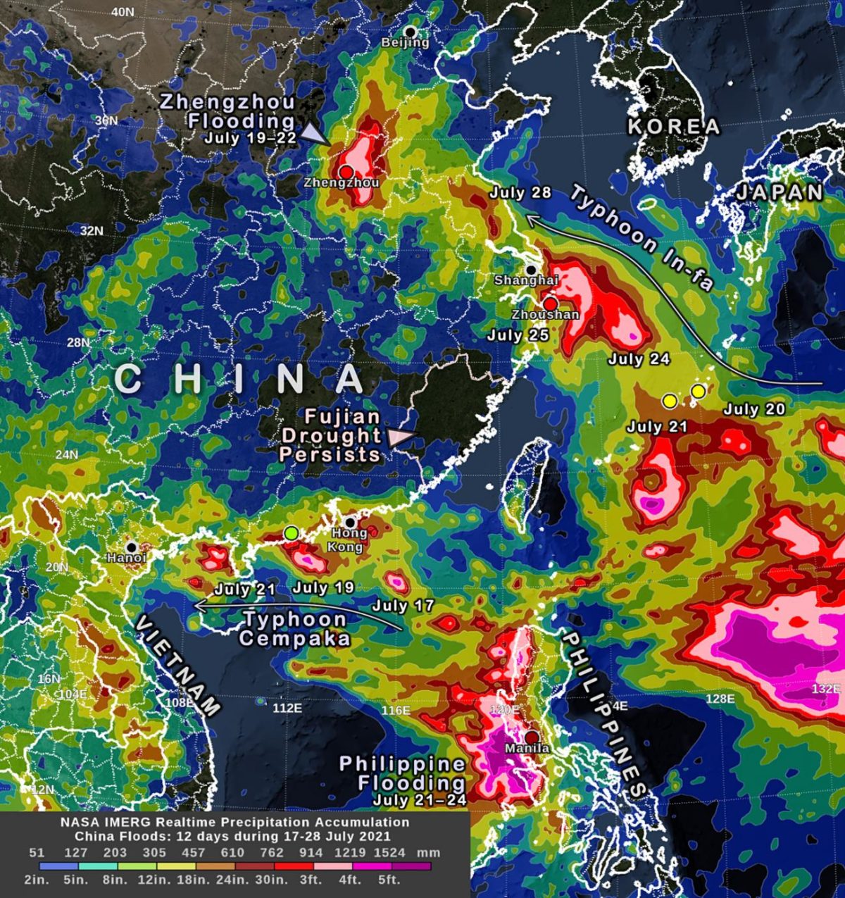
During July 17 to 28, 2021, several storm systems brought heavy rain to parts of China and surrounding countries, while a nine-month-long drought persists in an adjacent part of China.  NASA’s multi-satellite precipitation algorithm has been monitoring this rainfall in near real-time, and the estimates are distributed to weather-forecasting agencies and disaster-monitoring organizations.  This algorithm is called IMERG, the Integrated Multi-satellitE Retrievals for GPM. GPM is the NASA / JAXA Global Precipitation Measurement mission, which launched its Core Observatory satellite in 2014.

Two Typhoons

IMERG precipitation estimates from July 17 to 28, 2021, are shown in the image above. Among the weather systems impacting the region were two landfalling typhoons – Cempaka and In-fa.

One can see that over a foot of rain has fallen during this 12 day period along most of the coast from Hong Kong west to Hanoi, Vietnam. This rain came mostly from Typhoon Cempaka during July 17 through 19.

Over a foot of rain has also fallen during this time near Shanghai, which is China’s most populous city.  That rain came mostly from Typhoon In-fa during July 25 to 28.  According to Buckingham (2021), parts of Zhoushan City, near Shanghai, received at least 30 inches of rain from In-fa between July 23 and 27. Over the Pacific Ocean near China, two rain gauges in the Global Historical Climatology Network (GHCN) reported 12-inch rain accumulations during the July 17 to 28 period at locations where NASA’s IMERG algorithm also reported similar accumulations.  These gauges are located on two small islands, Japan’s Nago and Kumejima islands. Point estimates of rainfall are represented in the image as circles that is colored using the same color scale used to display the IMERG data that covers the globe.  Nearby over the ocean, where no rain gauges exist, the IMERG algorithm reported significantly more rain accumulation along the path of Typhoon In-fa, over 30 inches of accumulation.

Two Additional Storm Systems

During the same time, a synoptic system brought over 30 inches of rain accumulation to the Chinese city of Zhengzhou and surrounding areas of Henan Province during July 19 to 22.  According to Childs (2021), over 31 inches fell during a three-day period.

Also separate from the two typhoons, a storm system brought accumulations in excess of 20 inches to the western coast of the Philippines, near Manila, during July 21 to 24.  These accumulations were detected by the IMERG algorithm and are consistent with rain gauge data in Manila.

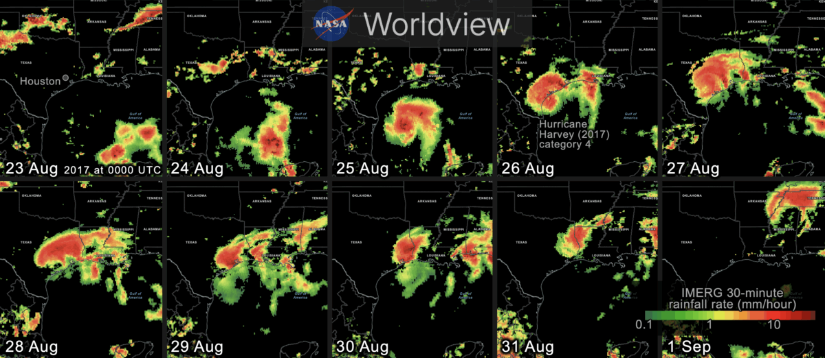
While such accumulations are impressive, they are not unprecedented.  For example, Hurricane Harvey (2017) stalled over Texas and brought over 60 inches of rainfall to a small area over a period of four days (Blake and Zelinsky, 2018).  IMERG was also used to analyze the rainfall from Harvey. 

A Persistent Drought

Meanwhile, a drought in Fujian Province in coastal China has persisted since October 2020 with rainfall accumulation less than 25% of the typical accumulation for part of Fujian Province. Deviation from normal rainfall can be estimated using the long-term record of IMERG estimates that stretches back to the year 2000.

Wang (2021) and Ye (2021) report that China’s coast south of the Yangtze River, a region that includes Fujian Province, only received 20% to 50% of the normal amount of rainfall between October 2020 and February 2021. IMERG data shows that summer rains have relieved the drought in the provinces adjacent to Fujian, but not in Fujian itself.

The regional rainfall patterns seen during the past two weeks over China are significantly different than the Meiyu-Baiu pattern of rainfall that IMERG detected at this time last year. Credit: Visualization and caption by O. Kelley.

Rainfall that Matters: A Convective System over Arizona within the North American Monsoon (July 2021)

North American Monsoon region
Figure 1. Geographic extent of the North American Monsoon. Larger Image: click here

There is a monsoon that occurs in the southwestern U.S. each summer, and it brought heavy rain to the deserts of Arizona this week. This monsoon is less well known than India’s Summer Monsoon, but both monsoons have similar causes [1, 2, 3].

In western Mexico and the southern edge of the southwest U.S., most of the year’s rain typically falls in just three months: June, July, and August. The region is shown in light blue in the below climate map, which shows where summer rainfall predominates (Figure 1). This seasonal pattern is known as the North American Monsoon. The map was generated using the long-term record of NASA’s IMERG multi-satellite precipitation analysis. Climatologists and forecasters have used various dates to define the exact start and stop dates of the North American Monsoon [4].

This year’s monsoon season has officially begun, and the week of July 12-16 has been an active monsoon week for Southern Arizona [5].

On the morning of July 15, 2021, the National Weather Service issued a warning for severe thunderstorms over Arizona’s southern desert with rain rates of 1 inch per hour over ground that was already saturated by recent storms [6]. Under these circumstances, flash flooding is a concern. The location of this warning is indicated by the red circle on the climate map (31.72N latitude and 112.13W longitude in Figure 1).

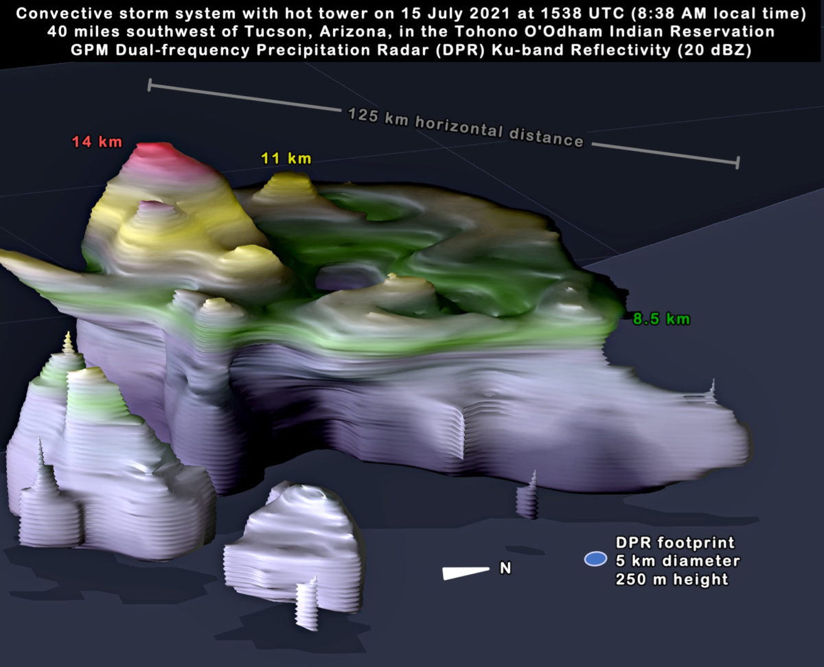
The NASA / JAXA GPM Core Observatory satellite captured a 3D view of a convective storm system at this location at 8:37 a.m. local time on July 15. The data was collected by the satellite’s Dual-frequency Precipitation Radar (DPR). The 3D view is shown in Figure 2. This overflight of the storm system showed several convective cells embedded within it with precipitation rates at the Earth’s surface in excess of 1.4 inches per hour. The strongest of these cells contained updrafts that were sufficiently strong to lift ice precipitation overshooting through the top of the troposphere. The troposphere is the lowest layer of the atmosphere that normally contains the weather.

Arizona Storm (2021)
Figure 2. 3D observation of a convective system over Arizona contributing to the North American Monsoon. Larger image: click here.

Shown in red in Figure 2, the Dual-frequency Precipitation Radar detected a 20-dBZ radar-reflectivity signal at an altitude 14 kilometers above the Earth’s surface and over 14.8 km above sea level. In Figure 2, the yellow and green areas identify where 20-dBZ radar reflectivity was detected at 11 and 8.5 km altitude, respectively. Commercial airlines cruise at 9 to 13 kilometers. At lower altitudes, this convective cell contained radar reflectivity in excess of 50 dBZ, suggesting hail was present.

This GPM satellite overflight of the storm system occurred at 8:37 a.m., approximately half an hour before the National Weather Service issued its thunderstorm discussion for the area [6].

This portion of Arizona receives only 10 to 15 inches of precipitation in an entire year, on average, according to the long-term record from NASA’s IMERG multi-satellite precipitation algorithm. Local accumulation exceeded 2 inches in places due to the convective storm system that passed through this area on July 15, 2021.  This storm total was estimated both by the near real-time IMERG algorithm and also by the National Weather Service’s preliminary analysis of ground-radar data [https://water.weather.gov].

It is typical of this area’s climate that heavy rainfall from convective systems such as this one contribute much of the area’s annual rainfall accumulation. According to the IMERG record, this portion of Arizona receives approximately 42% to 50% of its annual accumulation in June through August.  Visualization and caption by Owen Kelley (NASA/GMU).

References:

(1) NASA, 2017: NASA Looks at the North American Monsoon. 1:26 minute video featuring NASA Scientist Dr. George Huffman, https://gpm.nasa.gov/resources/videos/nasa-looks-north-american-monsoon.

(2) Branon, M., 2021 June 17: How the Weather Service cleared the air about Southwest monsoon season. Capital Weather Gang, Washington Post, https://www.washingtonpost.com/weather/2021/06/17/southwest-monsoon-sea….

(3) Adams, D. K., and A. C. Comrie, 1997: The North American Monsoon. Bulletin of the American Meteorological Society, 78, 2197-2213.

(4) June 15 is currently the National Weather Service’s official start date for the North American Monsoon.  Adams and Comrie (1997) propose June-August or July-September as possible date ranges for the monsoon.

(5) Arizona Daily Star, 2021 July 14: Tucson passes 2020 monsoon rainfall total; flash flood warning in effect, https://tucson.com/news/local/tucson-passes-2020-monsoon-rainfall-total….

(6) NWS, 2021 July 15: Mesoscale Precipitation Discussion #0546 issued at 9:10AM EDT on Thursday, July 15, 2021. Weather Prediction Center (WPC), College Park, MD, https://www.wpc.ncep.noaa.gov/metwatch/metwatch_mpd_multi.php?md=0546&y….